OutcomesAI
From no face to a full identity. Designing the experience and visual language of a healthcare AI.
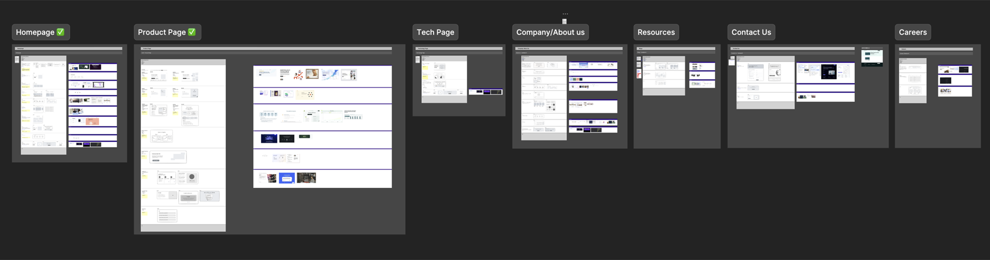
OutcomesAI builds Glia, an AI that works alongside nurses so clinical staff can focus on care. The technology was real, but the brand spoke to the wrong people in the wrong language and Glia had no visual identity at all. We rebuilt both the website and the design language, for the executives who buy it and the nurses who use it.
OutcomesAI builds Glia, an AI that works alongside nurses and handles routine patient calls so clinical staff can focus on care. The tech worked. The funding was coming. Hospitals were already piloting it.
Everything around it was the problem. The website spoke to the wrong people in the wrong language, and Glia had no visual identity at all: no face, no personality, nothing that showed anyone what using it actually felt like. We came in to fix both.
Strong technology. Invisible story.
Brand problem: The identity felt like just another tech startup. Abstract, jargon-heavy, and unclear about what the product actually did for a hospital.
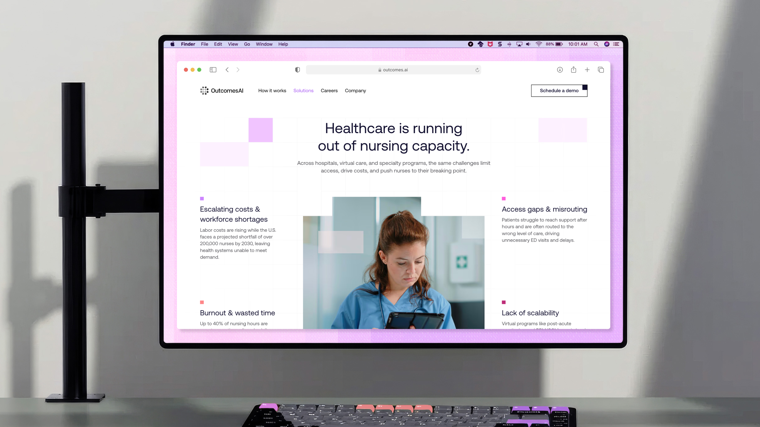
Product problem: Glia was the core of the platform but it had no visibility and no narrative. Decision-makers could not understand its value. If the CMO cannot explain it to the board, the deal does not happen.
Structural problem: The brand had no messaging system and the site architecture could not support new features, content, or team growth. Everything felt temporary.
We started with a five-section client interview: background, target audience, competitor positioning, website goals, and a deep dive on messaging and trust signals.
The competitor audit covered Abridge, Ambience Healthcare, Cohere Health, Fabric Health, Glass Health, and others. One pattern was consistent across all of them: every competitor led with technology. Features, models, architecture. That was the gap.
Healthcare buyers do not buy technology. They buy outcomes, safety, and less work for their staff. The insight that shaped the whole project: AI in healthcare should not feel like technology. It should feel like an invisible layer of support.
Two audiences. Zero overlap in what they need.
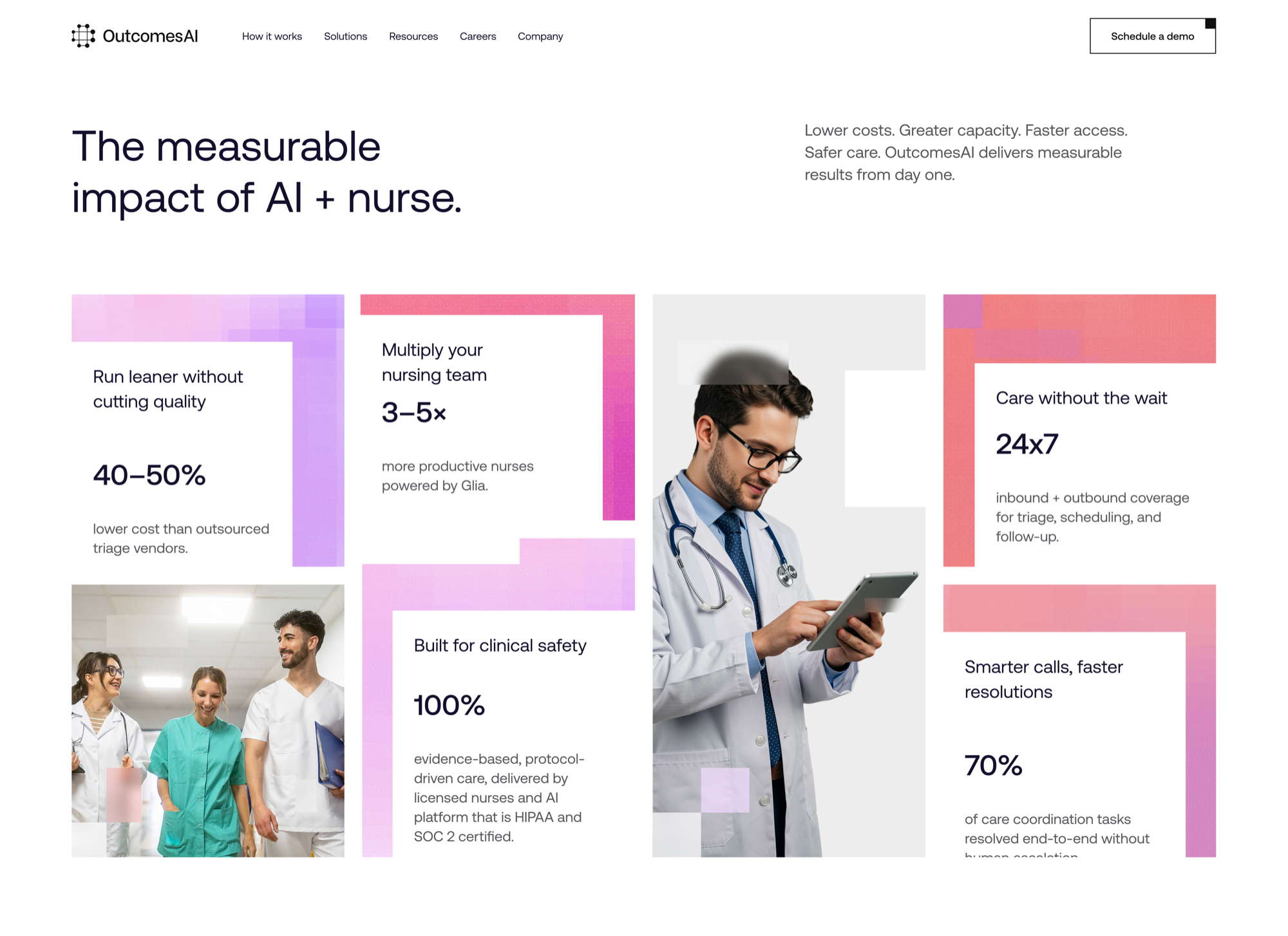
Every page, every section, every headline was written and structured against two people: the Chief Medical Officer and the Chief Operating Officer. They both sign the deal. They evaluate completely differently.
Clinical proof first.
Focused on patient safety, care quality, and what this means for nurses on the floor. Needs to see evidence-based protocols, clinical validation, and real testimonials from nursing staff. If it is not safe, the conversation ends.
ROI before anything else.
Focused on cost reduction, staff efficiency, and scalability. Needs to see numbers: cost per call, nurse productivity multiplier, reduction in overtime. If there is no clear return, the budget does not move.
The site architecture was built to serve both journeys without making either feel secondary. The homepage answers both questions in the first scroll. Solution pages branch into clinical and operational angles. Every CTA was written to mean something different to each person.
Glia had no face. We built one.
When OutcomesAI came to us, Glia existed as a product but not as a presence. There was no color, no illustration language, no personality. Nothing that made it feel like something a nurse could trust.
The design challenge was unusual: how do you give a face to something that works best when it is invisible? Glia sits in the background, listening, transcribing, routing, supporting. It had to feel present without getting in the way, and helpful without feeling clinical.
We built the entire visual identity from that idea.
Color as an Interface Signal
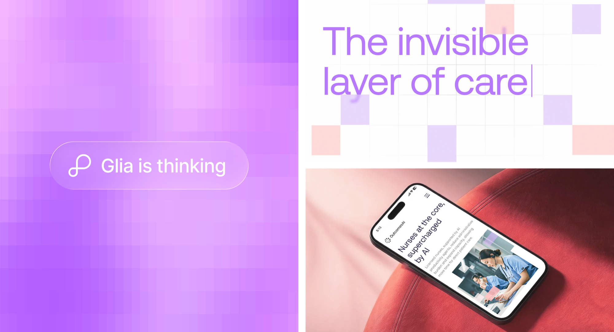
Healthcare tech defaults to cold blues. We went warm instead, so the product reads as care rather than infrastructure. Violet became the system color, reserved for anything Glia is doing, so users could tell the AI apart from the interface around it. The gradient carries states like "Glia is thinking", where color does the work of a loader.
The North Star
Stop selling OutcomesAI as a healthcare tool and start showing it as the layer nurses actually rely on. Everything we designed had to answer one question: does this make a nurse trust it on a real shift?
Glia on the Floor
The product does not live on a desk. A notification lands on the wrist mid shift, and one tap opens the patient behind it: vitals, alerts, and the last change in their chart. Glia moves with the nurse instead of waiting for them to come back to a terminal.
OutcomesAI raised $10M in seed funding after the new brand and website launched. The product is live and scaling across nursing settings in the US.
Glia now has a visual identity that clinical leaders understand and nursing staff can trust. The CMO can explain it to a board without us in the room. The COO can see the ROI before booking a demo.
And because the design system ships with its own generation tool, the identity grows with the company instead of depending on a design team to keep it alive.